Easy Guide to Making Stamps
3 July 2025
I love the lil' images people make for their personal websites. Buttons, blinkies, stamps - They add so much personality and are a huge part of the small web / old web culture. I wanted to make my own, but I've never done it before and wasn't sure what to do. It seemed simple enough but as someone who very rarely opens image manipulation software it actually took a little bit of learning and I wanted to write a quick guide on it in case anyone else wants to get into it but doesn't know how.
The type of image I'm talking about is stamps. They look like, well, stamps:

They're a 99x56 image, usually with that stampy looking border, and sometimes with writing in the corner.
The first thing you're going to need to make stamps is an empty stamp like this one:

Next, choose an image that you want to stampify. This can be tricky, not all images work well as stamps. Ideally you want one that's going to scale down to 99x56 well, so it should be wider than it is tall.
Next, for large images what I do is crop it to 990x560. I use KolourPaint for this, which is a Linux app that is practically identical to the default Paint app that Windows has, so if you're on Windows you can use that. Once I've got the image to 990x560 I use KolourPaint's built in scale function to shrink it to 99x56 and see if it looks okay. If the compression has ruined the image I go look for another one that might work better. Sometimes it's 95% there and I need to tweak it, like in the Psyduck stamp above his pupils disappeared due to the compression so I manually added them back in.
Now we have a 99x56 image and an empty stamp!
To combine the two, I use GIMP. You may be wondering why we didn't do the whole thing in GIMP, and you can if you want to. I just find KolourPaint a lot easier to use, so I try to do as much as possible in that because I'm a GIMP noob. GIMP is free and available on Windows too, but there are other options. Kleki is an online tool you can use, there is also Paint.NET, Krita, anything that supports transparency and layers will work.
The image should be your base layer, with the stamp layer on top. Since the stamp layer has some transparency on its borders I usually trim the image's edges so that it isn't poking through. If you're happy with the look you can stop here, but if you want to add some text then add a new layer above the stamp layer.
The iconic 'font' found on these types of images is super easy to write. Usually, each individual letter is 5 pixels tall and 3 pixels wide, and each letter leaves a 1 pixel gap between each other. The letters are then given a dark border for contrast. I write them backwards, because I find it's easier to line up your last letter with the edge of the stamp. When you zoom in close you'll see the stamp border has a grey border on the interior, the writing should start 2 pixels up and 2 pixels to the left of the bottom corner.
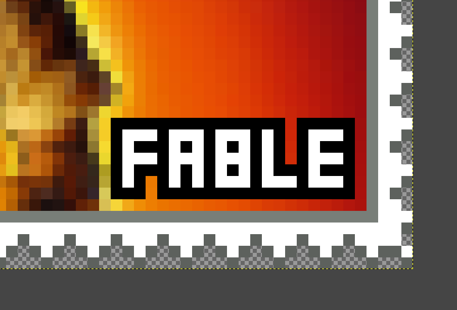
I always write the word in white and then wrap the word in a different colour. It should have high contrast with the white, so usually a dark colour is better. If you're unsure how to write a letter in this style, here is the English alphabet:


There's no hard and fast rule, several letters can be written different ways so do what you like most. I've seen some people leave the right corners off the B, or they write a W 5 pixels wide for example.
And that's pretty much it. Happy stamping!